Marvel Rivals, the acclaimed game from NetEase, has sparked recent conversations about its visual innovations and gameplay evolution. With radical character designs and an aesthetic approach beyond the conventional, the title seems to have steered away from a possible cancellation after a significant iteration process. The art director, Dino, has shared in a web series called Art Vision that the game’s aesthetic is “modern and adaptable,” although some of its user interface features have been subject to criticism.
A UI as spectacular as it is impractical
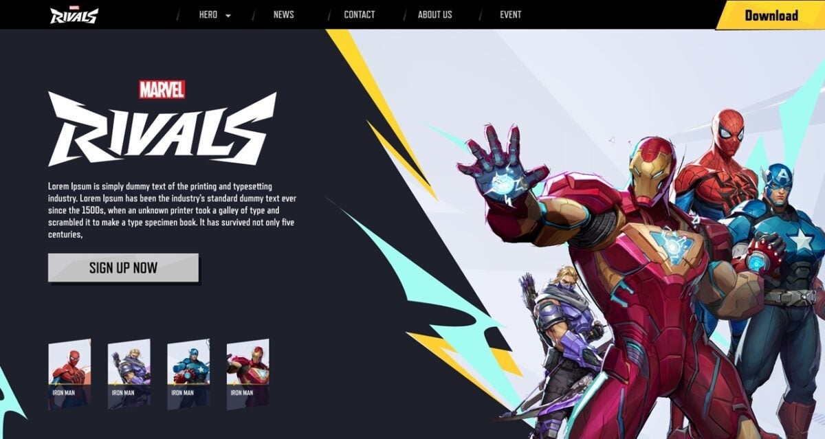
Particularly, the radial menu that was presented in the early versions of the game was considered “excessive” and, at times, complicated to use. Although fans have praised the sleek design and the exceptional 2D artwork, many agree that the way to navigate between heroes could be cumbersome. In its original form, the radial menu allowed players to search for characters in a circular layout, but the functionality felt like an impractical challenge, far removed from more traditional and efficient interfaces, as demonstrated in the final result of the game which opted for a conventional grid for the hero gallery.
Despite these challenges, Dino assures that the hero selection experience is designed to create an artistic immersion. However, some players believe that the bright aesthetics may detract from functionality. It is evident that throughout its development, Marvel Rivals has had to find a balance between aesthetics and usability, thus reflecting the essence of the video game industry: an art that must be appealing, but also practical.