5 Photoshop editing tricks to improve your photos

Go from a novice to a master with these Photoshop tips and tricks! Editing techniques for Adobe Photoshop.

Photoshop

Softonic is proud to partner with Adobe Creative Cloud. When you download from us, we may earn a commission.

Photoshop is a powerful tool. To get the most out of it, you’ll need to learn how to use it properly. It’s not a case of pressing some secret combination of keys and your photos will immediately look great with no effort at all. As with most things in life, good results require a little hard work.

Having said that, though, Photoshop is actually pretty simple to learn. And once you’ve acquired a few key skills, you can easily adapt these and apply them in many different photo editing situations.

If you would like to enjoy all applications from the Adobe Creative Cloud collection, this is the right time to switch! Adobe is offering an extra-special 40% discount on Creative Cloud All Apps. Act fast because the offer ends on 19th July.

The promotion, which is available in the United States, Canada, and Mexico provides individual subscribers with access to Adobe’s collection of products at a bargain price. With a 40% discount, the All Apps annual package is a steal at only $29.99 per month.

5 simple Photoshop editing techniques to improve your photos

This article doesn’t contain any magic editing solutions or great retouching secrets. Instead, what you’ll find below are 5 simple Photoshop techniques for improving your photos. Techniques that you can – and indeed, should – use again and again.

1. Shoot RAW, process for more

Image source: Unsplash

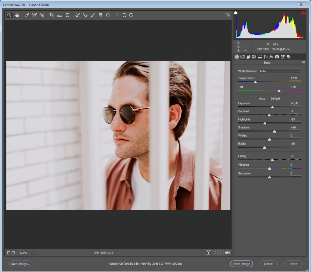
With the exception of smartphones, most modern cameras allow users to shoot their photos in high-resolution RAW format. If your camera permits this, then you should certainly do so, as it will give you greater information to work with when it comes to editing.

The thing is, though, if you don’t conserve all that information when you open your RAW files, then there’s not much point in shooting RAW in the first place. Conserving the info means keeping your extracted RAW files relatively neutral.

It’s better to keep all options open by processing your RAW files for the widest exposure latitude possible and with relatively neutral color settings. This way, even if you’ve already decided that you’re going for a stark and crunched photojournalistic vibe, all the info is still there in the file in case you need it.

2. Layer for effect(s)

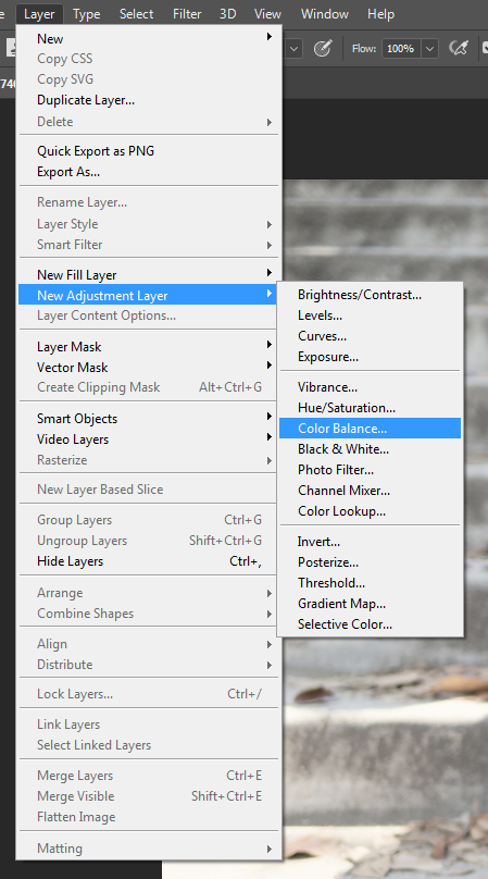
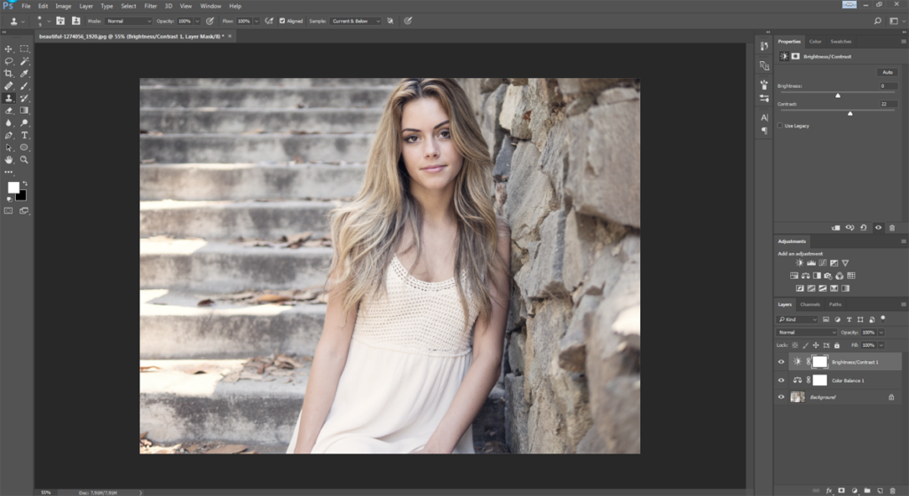
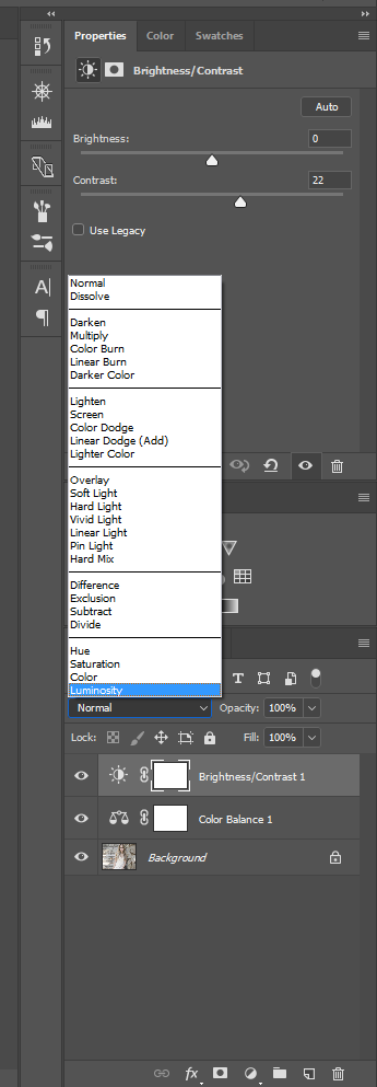
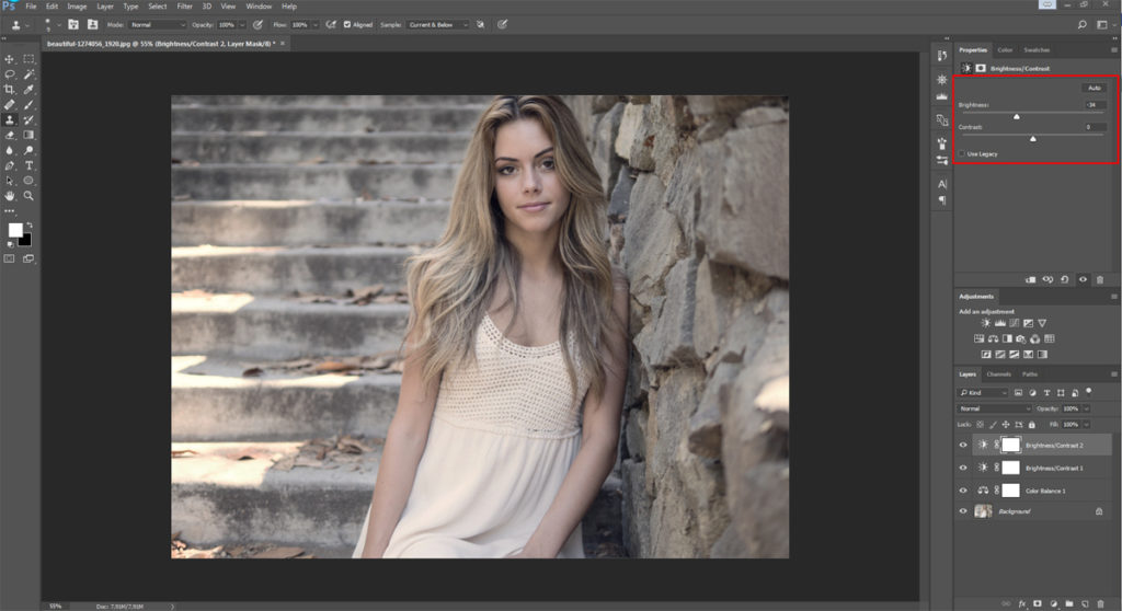
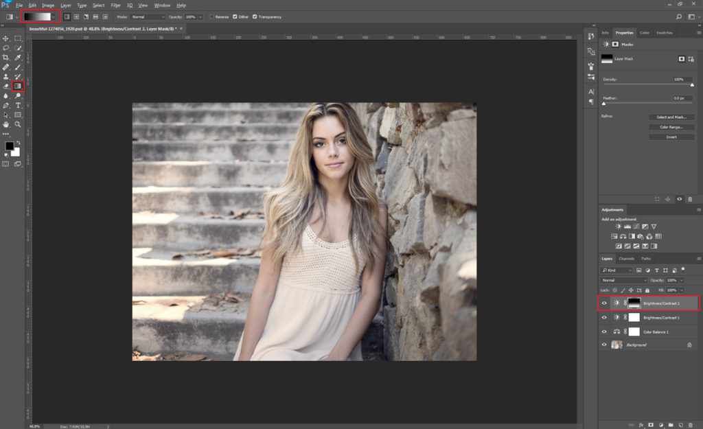
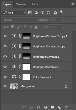
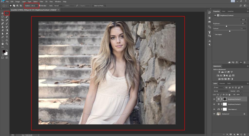
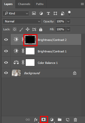
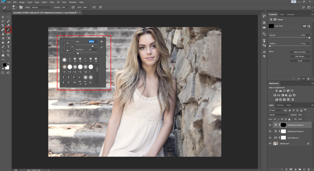
If you’re not already working with Adjustment Layers, you should be. Adjustment Layers sit on top of the background image, allowing you to make changes to things like contrast, color balance, saturation, and exposure, without destructively altering the original file underneath. This gives you much greater flexibility to go back and tweak edits or apply them selectively to only specific parts of the image.

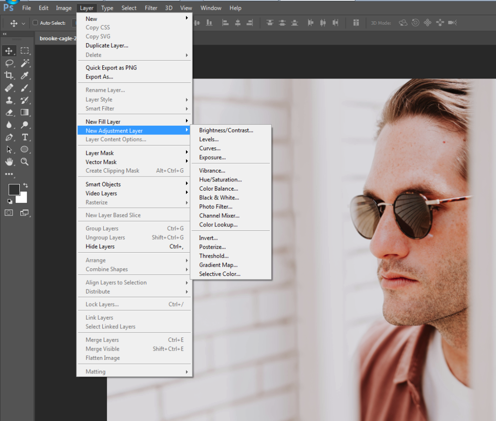
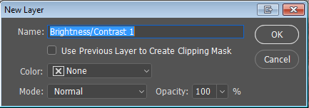
Next time you need to make edits to a photo, rather than going to Image > Adjustments, choose instead Layer > New Adjustment Layer and select the required adjustment from the menu there.

3. Get with the curves

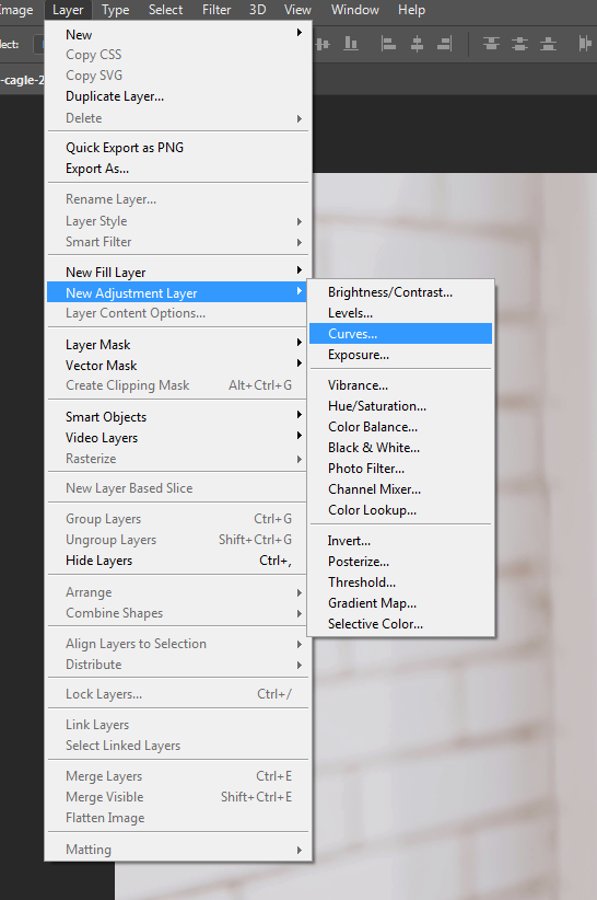
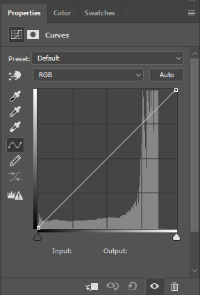
Use of the Curves adjustment is very definitely not a “trick” but rather a standard tool in any serious photographer’s photo editing kitbag. The Curves panel tends to freak a lot of people out the first time they use it; typically they’ll touch one end of the curve and the rest will go haywire, sending their photo into hyper-solarization or some similarly horrific result. For many, experimentation with curves ends there.

If this is you, it’s time to get over your trauma. The Curves panel is the correct way to edit brightness and contrast, permitting much greater control than the dedicated Brightness/Contrast adjustment panel will allow. Take a deep breath, steady your trembling hand, and go to Layer > New Adjustment Layer > Curves.

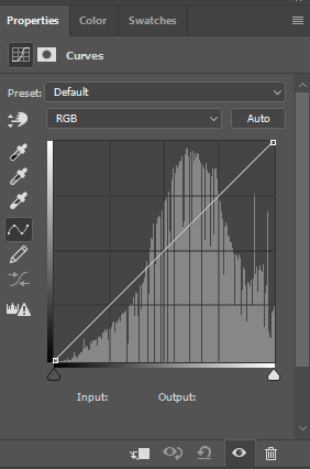
You’ll see the Curves adjustments panel: a graph with a diagonal line, rising from left to right. The bottom left represents the deepest blacks and shadow areas of your image. On the top right are the extreme highlights. In between lies the full range of shades present in your image file.

Image: scr05

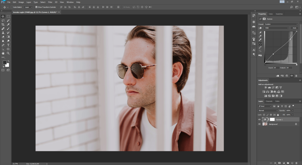
Click somewhere on the line; around the middle to make things simple for now. Drag it upwards and you’ll see the image become lighter. Go down for darkness.

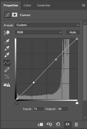
Now see what happens if you move the line upward in the middle again, and then shift the peak of the curve either left or right. As we already said, by moving the curve upward you make that part of the tonal spectrum lighter. In this case, with the peak in the middle of the line, we’ve adjusted the mid-tones. Keeping the curve raised while moving the peak of the curve to, say, the left will continue to lighten the image; it’s just that now it will lighten more in a different tonal region. As you move the peak away from the center, going slightly to the left, it’s now primarily the upper-midtones that become lighter.

However, due to the smooth and even way that a simple curve like this adjusts the image, although we’re making our curve adjustment closer to the left now in order to alter the upper-mids, you’ll see that the shadows also change along with highlight areas. Go further to the left still, and the highlights receive even more of the adjustment now. Notice, though, that the peak of the curve is not precisely where we’ve clicked on the line, but remains a little to the right.

The rounded shape of the curve means that we won’t end up doing any strange or unnatural things to our image as we adjust its density.

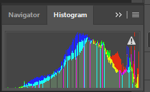
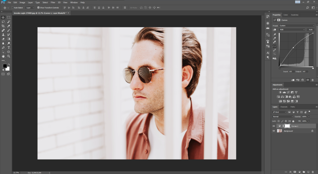
However, there are times when we might want to adjust one specific tonal area without changing the brightness of the others. By clicking another position on the curves line, you can create a second anchor point so that your first adjustment will stay locked in place even when you move another point on the line.

This allows you to easily lighten and darken different regions of the tonal scale independently of one another, without your curves flying off the scale like an athlete’s cardiograph.

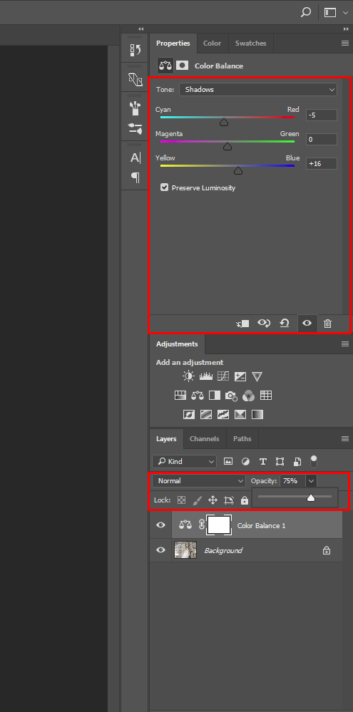
This is particularly handy for adjusting contrast with a high degree of precision. For example, shadow areas can be lightened at the same as highlights are toned down, giving a subdued, low-contrast look, as demonstrated in the image above.


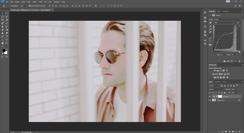
The Brightness/Contrast panel doesn’t permit anywhere near this degree of control, so once you’ve become comfortable with adjusting the Curves, you’re unlikely to ever go back.

4. Better dead than red

Some “white” skin is pinker than anything. Too long under the sun (or propping up the bar) and that pink can quickly turn into full-blown crimson. Not a great look. So what can you do if your subject comes out looking like Rudolph the Reindeer?

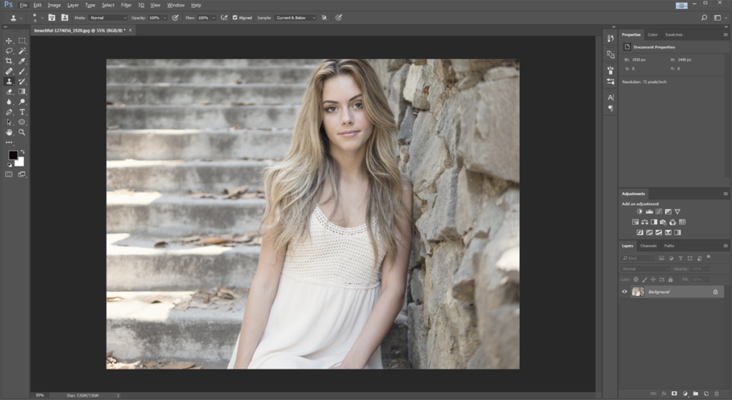
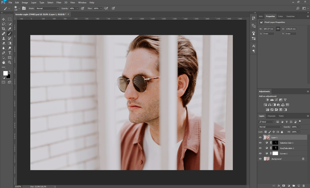
The obvious thing to do here is just to reach for the Color Balance controls and reduce the amount of red in the image overall. The problem is that there will likely be other areas of the photo with red in them that we want to keep red. For example, in our photo, the guy is wearing a nice red shirt that needs to stay that way. How do we get around this?

Image: scr12

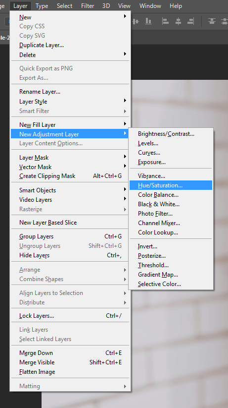
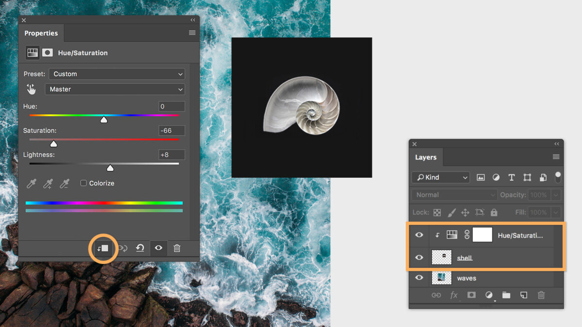
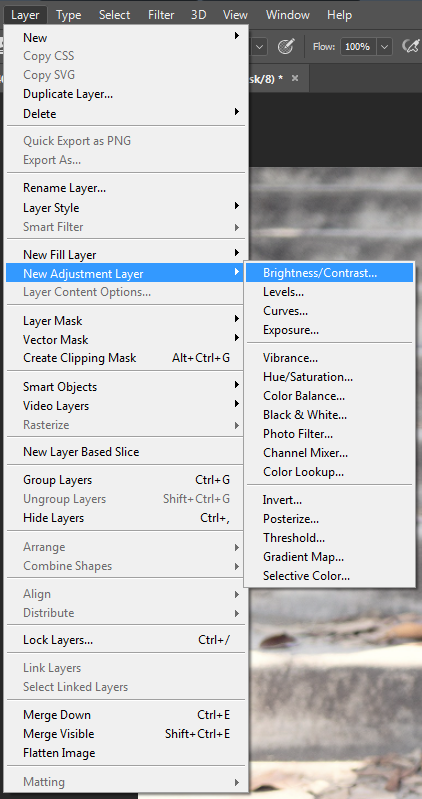
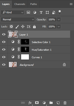
No big deal: create a new saturation Adjustment Layer by going to Layer > New Adjustment Layer > Hue/Saturation (see above) and changing the layer’s settings from Master to Reds on the drop-down menu.

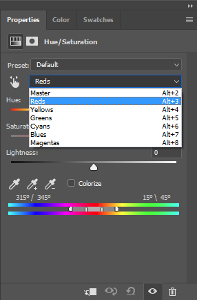
Now any changes you make here will only affect the red areas of the image. Play with the saturation, lightness, and maybe even hue sliders, until the offending red area is closer to the rest of the subject’s skin tone, and then fill the entire Adjustment Layer with black, or hit Ctrl+Backspace (Mac Alt+Backspace) to mask the effects of the Adjustment Layer.

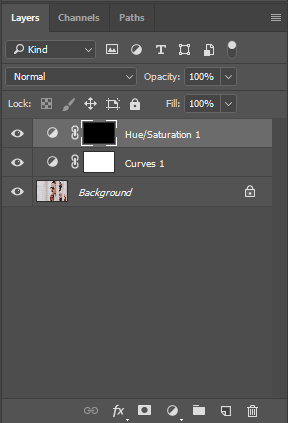
Now grab the Paint Brush tool, and carefully paint over the worst-affected red areas with white to reveal the effect of the desaturated Adjustment Layer again, but only in these specific areas.

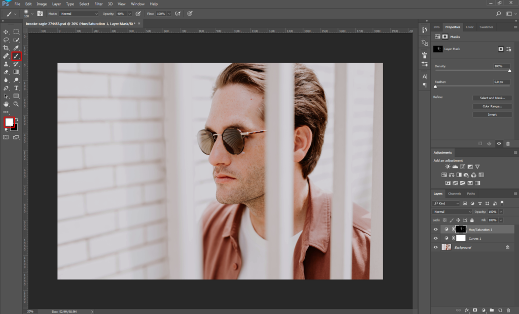
For example, in the image above, notice how the unsightly redness in the model’s skin on his nose, ears and eyes has been totally removed (without altering the tone of his shirt or other red areas) by erasing the mask over the desaturation Adjustment Layer only in these regions. If necessary, you can now go back to the adjustment panel and tweak the level of desaturation again until things look completely natural. (Let’s be honest: A totally gray nose won’t look much better than a bright red one.)

Depending on skin tone, lighting conditions, camera sensor, and other factors, your subject’s bulbous “red” nose might be more magenta than anything, though. So if the above steps don’t seem to make much difference, you can try repeating the process, but this time changing the magentas rather than the reds.

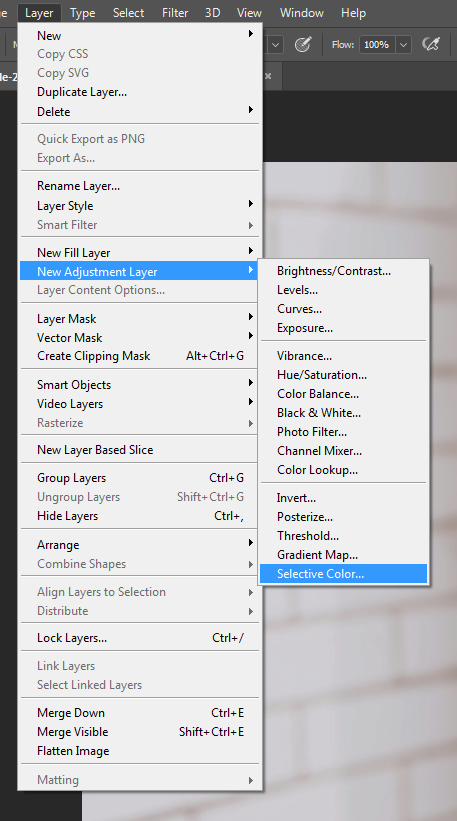
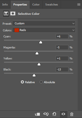
You can also go to Layer > New Adjustment Layer > Selective Color and alter the precise shade of the reds or magentas in this way, too (for example, by adding more yellow or cyan). Again, you’ll then need to mask the entire Adjustment Layer with black before painting it back in just where needed using white.

Naturally, this technique isn’t restricted only to fixing problems with red or magenta. It can be a great solution for toning down distracting marks, patches, or other imperfections in any color range you need – whether on human skin, eyes, clothing, or the walls of a room.

5. Quick layer composite

Yeah, yeah, we said there aren’t any Photoshop “tricks.” But to finish off, here’s the exception that proves that rule.

Let’s say you’ve got a lot of layers on your photo, and you need to make an adjustment to all of them at once… but still with the ability to go back and edit those layers separately later. What’s the solution? Make a copy of each layer one by one and then flatten these copies into a single layer?

Well, yes and no. In practice, that’s exactly what you need to do. However, there’s a shortcut: Instantly make a composite layer combining all open layers by pressing Shift+Ctrl+Alt+E (for Mac, Shift+Cmd+Option+E).

Now you can edit the composite without losing your original layers or going through the hassle of duplicating them all. Don’t forget to first switch off any layers you don’t want to be included in the composite.

Now it’s over to you

Skillful editing with Photoshop is all about finding clever workarounds for the unique challenges that come with each new photograph. Having a clear vision of where you want to take a photo when you start editing will make things easier, but you’ll also need a few basic skills and techniques under your belt before you begin – even if you’ll often find you have to get creative by applying these skills in new and unconventional ways.

The techniques listed above can all be used and adapted depending on your needs in order to fix numerous problems beyond the few we mention here. The only real limit is your imagination!

The 10 best cloud storage services for photographers

Whether you’re an occasional snapper or a semi-pro fanatic, the loss of a lifetime’s worth of photographs is a disaster nobody wants to face. Hopefully, you’re already in the habit of regularly backing up to a second (or even third) hard disk, and storing this well away from the original files. But in reality, even this level of precaution will not totally safeguard you from potential misfortune; a badly timed combination of technical malfunction and an “act of God” could still conspire to erase all your visual memories in an instant.

Rather than putting all your eggs in a single basket, most professionals advise making an additional backup of all photographs online for extra security and peace of mind. But which cloud storage platform to choose? Check out our online photo backup guide for the full lowdown on the best online file storage, organization and viewing platforms for photographers currently out there.

The 10 best cloud storage services for photographers

Cloud-based photo services: what to look for

Not so long ago, if you wanted to deliver a large number of high-resolution photos to someone, you’d either have to mail them a hard disk or send a couple of gigabytes at a time via suspect file-sharing services such as RapidShare or Megaupload. As these sites would often delete your files after a period of inactivity, they clearly didn’t make for a practical long-term storage solution either. Meanwhile, your best option for an online photo backup and viewing platform was likely something along the lines of Photobucket or Image Shack: ugly, unwieldy, and offering only very limited space.

Now cloud storage services are cheap, convenient and offered by pretty much everyone and their dog. While this is great news for photographers – with our endless gigabytes of data to back up – some of these platforms are more suitable for photo storage than others. This is particularly the case if you’re looking for something a little more sophisticated than merely a virtual storeroom in which to dump all your files and then forget about them.

Thankfully, there are now many cloud storage platforms marketed to photographers, and these tend to offer an array of additional services beyond simple backup. For example, it’s now quite common to find advanced options for viewing, organizing, data-tagging, adding captions, sharing and delivering files. Even selling prints of your photos! However, there’s still a considerable degree of variation even between these photo-specific platforms, and so it pays to first consider what your own needs are as a photographer before then looking into the precise services offered by each of the main contenders.

Of initial concern for most people will likely be the convenience (or otherwise) of a platform’s user interface – not to mention the tasks it will permit you to carry out with your files once they are uploaded. However, there’s also the question of storage format to consider; for any serious photographer, the ability to store RAW files is going to be one of the most important requirements. Yet, surprisingly, this option is not offered even by some of the self-avowedly photo-oriented storage sites.

While we would advise photographers of all levels to shoot their photos as high-resolution RAW files, we realize that for many beginners, casual shooters, or those mostly using smartphones, a lack of support for uploading RAW files is not going to be a deciding factor when choosing cloud storage. For this reason, where a platform is otherwise very photography-friendly and offers some genuine advantages, we have included it in our list even if storage of RAW files is not currently permitted. Aside from this, and even putting RAW support aside, each photographer’s needs will likely differ quite significantly. With that in mind, this guide is designed to offer readers the necessary information to compare currently available cloud storage solutions in order to select the best option for their own uses.

500px

Source: https://500px.com/

You likely already know of 500px as a social network and “marketplace” for photographers. What you may not know, however, is that by signing up for one of their “Awesome” or “Pro” accounts, you also get access to unlimited storage.

Bizarrely, for a platform that claims to be geared toward the professional as much as the amateur, 500px lacks RAW support. However, if this is not a major concern for you, their pricing is competitive when compared with other storage providers, and becomes even more so if you’re also on the lookout for some of the other services a paid 500px membership includes: a photographer’s profile, public and private galleries, a dedicated app, the ability to collect photos by other photographers, and a listing in the 500px directory.

500px at a glance

  • Storage: unlimited
  • RAW support: no
  • Photo viewing, organizing, tagging: yes
  • File sharing/sending: yes
  • Automatic file backup: N/D
  • Cost: various price plans, from $2.50 to $12.99 per month

Amazon Drive

Source: https://www.amazon.com/clouddrive

Using Amazon for your cloud storage needs might feel a little like going to Home Depot to get burritos: you certainly can, but it’s not necessarily the first place that comes to mind. But while there’s nothing worse than a bad burrito, in many ways storage is just storage, and Amazon offers a good service at reasonable rates.

In fact, if you already have an Amazon Prime account and just need somewhere safe to back up your files, then look no further, as Amazon already has you covered with free unlimited photo storage.

Amazon Drive at a glance

  • Storage: from 5GB to an unlimited number of photos, depending on the price plan
  • RAW support: yes
  • Photo viewing, organizing, tagging: no
  • File sharing/sending: single images only
  • Automatic file backup: yes
  • Cost: Free with Amazon Prime account, which costs $119 per year. Otherwise, you get 5GB of storage free with a regular Amazon account, or you can go for 100GB for a cost of $11.99 per year.

Backblaze

Source: https://www.backblaze.com

Unlike some of the other platforms we look at here, Backblaze’s cloud storage is not a secondary add-on to some other service, but rather their primary raison d’etre. Backblaze is no more and no less than a serious, dedicated, file sync and backup service provider. From a photographer’s point of view, the downside to this is that there’s no flashy interface, no pretty image galleries, no networking opportunities, no community feedback or pro photography tips.

However, if you’re just in the market for a secure, no-frills vault for your photos, Backblaze is the place. “Unlimited Files. Unlimited File Size. Unlimited Speed” is their tag line, and it’s hard to find fault with that.

Backblaze at a glance

  • Storage: unlimited
  • RAW support: yes
  • Photo viewing, organizing, tagging: no
  • File sharing/sending: yes
  • Automatic file backup: yes
  • Cost: $50 per year

Carbonite

Source: https://www.carbonite.com
  • Offering secure data backup for individuals and businesses, Carbonite occupies a similar position to Backblaze. Again though, there are no facilities for conveniently viewing, organizing or adding metadata to your photos. However, any such changes you make to your files locally on your computer will be remotely updated by Carbonite’s automatic backup service.

Carbonite at a glance

  • Storage: unlimited
  • RAW support: yes
  • Photo viewing, organizing, tagging: N/D
  • File sharing/sending: yes
  • Automatic file backup: yes
  • Cost: from $59.99 per year to backup one computer, to $269.99 for multiple devices

Dropbox

Source: https://www.dropbox.com

You’re likely already familiar with Dropbox; for several years they’ve bridged the gap between old-school file-sending services such as Mediafire and the newer breed of large data cloud storage services.

If you haven’t checked Dropbox out for a while, though, you’ll likely find that there have been a few new developments. For example, although it’s been possible to save RAW files on Dropbox for some time, any RAW files you upload to Dropbox now will also be viewable as a preview image, making the platform a much more convenient solution for both backing up and organizing photo libraries.

What’s more, Dropbox has added a bunch of handy tools for sharing and sending images, and you can now design presentations, add captions, logos etc. and even keep tabs on viewer behavior by means of built-in data tracking tools.

While Dropbox has significantly altered their price plans over the last few years, this doesn’t seem to have made services any cheaper, but instead just served to camouflage rising rates. What’s more, their “unlimited” storage plans are in fact initially capped at 1TB of data, with the requisite that you contact them personally asking for an increase to this limit should you require more space.

Dropbox at a glance

  • Storage limit: 1TB on individual plan; theoretically unlimited on Advanced plans, but for this privilege, you’ll need to pay out for a minimum of 3 users and then write to Dropbox begging for more space.
  • RAW support: yes
  • Photo viewing, organizing, tagging: some
  • File sharing/sending: yes
  • Automatic file backup: yes
  • Cost: $8.25 per month for an individual user; $20 per user x3 for Advanced plan (i.e. at least $60 per month)

Flickr

Source: https://www.flickr.com/

Flickr is, of course, known first and foremost as a social media platform for uploading, sharing, viewing and commenting on photos. But due to the need to store all those uploaded files somewhere, it is also one of the longest-running cloud storage services for imagery out there. The combination of social media networking opportunities, image viewing and organizing tools, and free file storage space makes Flickr a pretty appealing option for the casual photographer.

However, on the downside, there’s a maximum size limit of 200MB for image files (1GB for videos). And while this won’t be a problem for most users, anyone hoping to upload huge files shot using medium-format cameras, or containing multiple Photoshop layers, will find their attempts blocked. Worse still, Flickr doesn’t allow users to upload RAW files at all.

If you can live with looking at ads each time you log on and don’t need to upload large files, then Flickr makes for a great free photo storage solution. However, as the paid version offers no increase in storage space, has the same file size restrictions as the free version, and doesn’t support the uploading of RAW files, more serious photographers should probably spend their money elsewhere.

Flickr at a glance

  • Storage limit: 1TB
  • RAW support: no
  • Automatic file backup: only with paid plan
  • File sharing/sending: some
  • Photo viewing, organizing, tagging: some
  • Cost: Free with ads; $5.99 per month without ads

Microsoft OneDrive

Source: https://onedrive.live.com/

While Microsoft’s cloud storage solution shares features such as automatic syncing and easy remote access with many other platforms we look at here, one further advantage of OneDrive Premium is access to the Office 2016 range of apps. Similarly, if you already have Windows 8.1 or later installed, or use Office 365, then you already have access to OneDrive too.

Beyond this, OneDrive offers plenty of options for creating and sharing photo galleries and folders, including time-limited links. However, there is currently no option to protect such links by means of a password. One major drawback: Although RAW files can be uploaded to a OneDrive account without issue, Microsoft currently doesn’t offer any facility for previewing those files online, which many users find frustrating. The limit for a single file uploaded to OneDrive is 10GB, which is more than enough for any photo file you might conceivably need to upload.

Microsoft OneDrive Download Free
7

Microsoft OneDrive at a glance

  • Storage limit: 1TB
  • RAW support: you can upload RAW files, but not preview them
  • Automatic file backup: yes
  • File sharing/sending: yes
  • Photo viewing, organizing, tagging: yes
  • Cost: $1.99 for 50GB; $6.99 per month for 1TB

Photoshelter

Source: https://www.photoshelter.com/

Photoshelter pitches itself as an all-around professional solution for photographers. So while they offer many different services – including websites, marketing tools, and e-commerce capabilities – it also means that they take the provision of cloud storage facilities very seriously, too. Consequently, access is made as easy and convenient as possible, and there are various facilities for tagging, sharing and delivery of images. Not to mention selling and licensing them.

For Pro account holders, there’s no limit to either the size or quantity of files that can be stored in the Photoshelter cloud. Similarly, the platform allows users to upload every possible format of image file – including, of course, RAW. Be warned, though, that you’ll need to pay a high price in order to take advantage of all the excellent services that a Photoshelter Pro account provides.

Photoshelter at a glance

  • Storage limit: 100GB for a standard account, unlimited for Pro users
  • RAW support: yes
  • Automatic file backup: no
  • File sharing/sending: yes
  • Photo viewing, organizing, tagging: yes
  • Cost: $45 per month when billed annually

SmugMug

Source: https://www.smugmug.com

SmugMug is very similar to Photoshelter, in that beyond mere cloud storage, the platform also offers services such as website building tools, password-protected galleries, extensive image-tagging and captioning facilities, and even e-commerce solutions. Where SmugMug primarily differs from Photoshelter, though, is in the price: while both offer unlimited storage, an entry-level SmugMug account costs approximately the same per year as you’d pay each month for a Photoshelter Pro account!

SmugMug at a glance

  • Storage limit: unlimited
  • RAW support: yes, but need to pay extra for SmugVault extension
  • Automatic file backup: no
  • File sharing/sending: yes
  • Photo viewing, organizing, tagging: yes
  • Cost: from $3.99 to $25 per month (paying annually)

Zoolz

Source: http://home.zoolz.co.uk/

Zoolz differs a little from the other platforms we look at here. Rather than just being a regular cloud storage service that you can access from anywhere at any time, Zoolz is a more specialized company offering long-term file storage solutions at an affordable price. This means that while storage is secure, it’s a little less convenient for making and retrieving regular backups of your image library. Instead, your original high-resolution files are put into “cold” storage, from where they need to be “ordered” in advance before being taken out of the deep freeze – a process that can take several hours to complete. In the meantime, you are given access to low resolution “hot” copies of these files, which are always instantly available for browsing.

This restriction, of course, means that Zoolz will not be everyone’s first choice for cloud storage provider. However, the platform offers a preview feature for RAW files that not only makes it a better solution for photographers than most other cold storage services around, but in fact more suitable for serious shooters than some of the most-popular instant-access solutions we look at here – many of which don’t allow the uploading of RAW files at all, never mind any kind of preview facility for them.

Zoolz at a glance

  • Storage limit: from 7GB upwards
  • RAW support: limited to only Canon, Nikon and Sony RAW files
  • Automatic file backup: yes
  • File sharing/sending: yes
  • Photo viewing, organizing, tagging: no
  • Cost: free and upwards

Final thoughts

If we just consider quality and range of services, the most serious option for photographers is likely Photoshelter Pro; fulfilling, as it does, all our basic requirements bar automatic backup and excelling at a whole lot more besides. Sadly, Photoshelter Pro also comes with by far the heftiest price tag of any of the platforms we look at. Although, to be fair, by paying this extra premium you get much more than just the cloud storage.

For those unlikely to make use of all of Photoshelter’s extra tools and facilities, or just unwilling to pay out such a huge fee, SmugMug comes a pretty close second place. And, if you go for their cheapest price plan, also makes for a very affordable alternative.

Meanwhile, for more casual photography enthusiasts, other options such as DropBox or Amazon Drive will undoubtedly be up to the job and won’t break the bank.

Finally, for those in need of a good long-term backup solution, but not overly concerned with speedy retrieval times, Zoolz is the one to look into.

Pro Photoshop tips everyone can use: working with Adjustment Layers

Perhaps the greatest single leap forward any beginner can make when starting out with Photoshop is learning to work with Adjustment Layers. In this easy-to-follow guide we explain exactly how.

Pro Photoshop tips everyone can use: working with Adjustment Layers

Source: Pixabay

What is an Adjustment Layer?

An Adjustment Layer is a transparent layer that is placed over an image in Photoshop to add an effect without making any destructive changes to the original photo below. An Adjustment Layer functions like a filter but with an added degree of flexibility and control.

Imagine sheets of acetate stacked over a printed photograph, each one altering the look of the photo at the bottom of the pile. As the acetate sheets aren’t permanently attached to the photo, they can be switched out for others, or shuffled into a different order.

That’s pretty much how Photoshop Adjustment Layers work: As Adjustment Layers are totally separate from the background image, you can keep tweaking them until you get the photo looking just how you want it. All without making any destructive changes to your original file.

This has three main advantages: the strength of the effect can be adjusted at any time by changing the opacity of the layer; an Adjustment Layer can be made to alter only a specific section of the image by adding a layer mask; and if you totally change your mind about the effect of an Adjustment Layer you can easily switch it off or even just delete it.

Image: scr01

Going to Image > Adjustments > Color Balance would permanently change the colors of the background image. Instead you should go to Layer > New Adjustment Layer > Color Balance, where you’ll be prompted to choose a name for the Adjustment Layer. Now you can work on the colors of your photo, safe in the knowledge that the changes can easily be modified or discarded later.

Image: scr02

For example, once you’ve made your adjustments to the colors, you can fine-tune the strength of the effect with the Opacity slider on the Adjustment Layer panel.

This is particularly handy if you come back to an image you were working on earlier, only to decide that you went overboard with the color adjustments and want to bring things back a little closer to how they were before. Drop the opacity to somewhere between the two, and you’ve got an instant compromise without having to re-do your work.

Up the contrast

Editing color is just one example of how you can use an Adjustment Layer. In fact, you should use Adjustment Layers for almost any photo editing task. Take the contrast, for example. Depending upon the lighting conditions when shooting, images straight out of the camera can often look a little flat and lifeless. This is especially true when photographing on a cloudy day or in the shade. Increasing the contrast will help to give a photo a little extra graphic impact, but effectively also reduces the amount of information in your photo. For this reason it needs to be done carefully.

Although Photoshop has an Auto Contrast function, this should generally be avoided, as it gives no control over the degree of contrast that will be applied to your image. On top of which, the Auto Contrast command is applied destructively to the background image, not as an Adjustment Layer, and so will permanently alter your original file. Never a good idea.

Instead, go to Layer > New Adjustment Layer > Brightness/Contrast, and once again choose a name for the Adjustment Layer.

Now tweak the Contrast slider until you achieve the desired degree of punch.

More advanced users might want to go to Layer > New Adjustment Layer > Curves instead. The Curves panel offers a much greater level of control over adjustments to brightness and contrast, but is notoriously scary for beginners to use. (Learn more about Curves in this article.)

As with many Photoshop editing techniques, adjustments to the contrast of an image can easily be overdone – making your photos look trashy and amateurish. For a more sophisticated and technically accomplished look, pay particular attention to shadow and highlight areas when adjusting the contrast. Is there still some detail in the shadows, or have they all turned to black? What about the highlights, is info still visible there? Or have the highlights burned out completely, becoming just an empty white space?

Subtlety is key: You’re looking for extra bite, but without losing too much information. To check for burned out areas, go to Window > Histogram, and a panel will appear displaying histogram information for your photo.

Dodging and burning

It’s rare that a photo isn’t significantly improved by a bit of creative “dodging and burning.” While Photoshop has dedicated Dodge and Burn tools, there’s actually a better way of achieving this using Adjustment Layers.

Before we get to that, though, what do we actually mean by the term “dodge and burn”? And what’s it used for?

The expression dodge and burn is a hangover from the days of analog film photography. It refers to the technique of partially blocking the light from a photographic enlarger in the darkroom – exposing some areas of the photographic paper for more (or less) time than others. This has the effect of making those particular sections darker (or lighter) than the overall exposure of the print.

Burning for Balance

There are several reasons why we might want to do this to a photo. First, the balance of an image is extremely important. Darker areas feel “heavy,” while lighter ones feel, well, “light.” For an image to appear balanced, our eyes expect to see heavier (i.e. darker) areas at the bottom of the frame. But as they don’t always come out that way when we shoot them, we’ll often need to give the image a helping hand in the editing stage. Similarly, if the main subject of the photo (for example, a person) is on the right side of the shot, then the composition might feel more balanced if some “weight” (i.e. density) is added on the left side in order to compensate.

The best way to do this is to create a new Adjustment Layer (Layer > New Adjustment Layer) either for Brightness/Contrast or, if you’re feeling brave, Curves. As we want this Adjustment Layer only to alter the exposure of the image – rather than the colors or anything else – we’ll also need to change the Mode setting in the Adjustment Layer panel from Normal to Luminosity.

Let’s say we want to darken the bottom third of the frame to give a greater feeling of solidity and balance to the image. Our next step, then, would be to create a second Brightness/contrast Adjustment Layer (don’t re-use the first one we already made, though, as this would just undo its effects). Now move the Brightness slider left to the degree that you want to darken the bottom of the frame.

Of course, this darkens the whole image all at once. So now we need to select the area of the image we wish to mask from the effects of the Adjustment Layer (in this case the top two-thirds of the frame). Painting with black on an Adjustment Layer creates a mask which blocks that part of the Adjustment Layer so that it doesn’t have any effect on the background image. What we want to do now, then, is to select the bottom third of the image using the Gradient tool.

To do this, make sure the background and foreground are set to white and black respectively, and draw a line using the gradient tool descending from approximately the top 1/3 mark down to the bottom 2/3 mark. Now the effects of the Adjustment Layer will be visible only on the bottom part of the image, gradually fading out about a third of the way up.

If the effect is still too subtle – if the bottom part of the image isn’t dark enough – we have two main options open to us. The easiest solution is to move the Brightness slider further to the left on the Adjustments panel, darkening the bottom of the frame. However, the feathered gradient might not be gradual enough to handle this, and so the effect might become too obvious. If that happens, the alternative is to keep our first Adjustment Layer as it was, and then repeat the above process, only this time making the gradient begin a little lower down or higher up the frame. This way it will overlap with, but not exactly match, our first adjustment layer; likely making for a smoother transition.

We can go on stacking adjustment layers in this way as much as we need to, until we get a nice smooth gradient and the desired degree of burning at the bottom of the frame.

Vignetting

Another highly effective editing technique is vignetting; that is, subtly darkening the corners and edges of a photo while leaving the center normally exposed. This has the effect of drawing the viewer’s eye into the frame and can be achieved in exactly the same way that we added weight to the bottom of the frame in the steps above. Only this time we draw a circle with the Lasso or Elipse tool in the center of the photo so that the Adjustment Layer only alters the edges and corners of the frame.

You may need to experiment with the degree of feathering (gradient) here, as the exact results will depend upon the size of your image. In our example we feathered the selection by 250 pixels, but if you are working on a much larger file you may need to input a higher value here (the maximum amount of feathering Photoshop will currently allow is 1000px).

Be careful with this vignetting effect, though, as it is often overused and can look amateurish if applied heavy-handedly. Vignetting should be subconsciously felt rather than seen. As a general rule, if the effect is immediately noticeable, then it’s probably too much.

There’s no reason not to use vignetting in tandem with other burning techniques, too. For example, we might want to go for a subtle vignette and darken other areas of the image as well.

Focusing attention

Clever use of dodging and burning can also help to draw the eye toward the main subject of a photo by toning down distractions. For example, if a person is photographed in a busy scene, with a lot of competing information all around her, the viewer may be unsure where to look. By lightening up the main subject, or even just the face or eyes if the subject is a person, and burning down any bright or distracting areas of the foreground or background, there will be less information competing for the viewer’s attention. This way it will be more obvious precisely which element is the main subject of the photo, and its impact will be much greater.

Finally, dodging allows you to “pull up” any information that you want people to focus on, while burning can help hide imperfections or superfluous information that adds nothing to the photo’s “story.”

What’s the best way to do this?

Let’s imagine that we want to darken down one particularly distracting element in a photograph. There are various ways we can about go it, but perhaps the most effective is to create a new Brightness/Contrast Adjustment Layer and slide the Brightness control to the right to darken the image, just as we did above. This time, though, we don’t make a selection with the Lasso or Gradient tools, but instead immediately fill the entire Adjustment Layer with black using the Paint Bucket tool or by pressing Alt+Backspace (alternatively, Alt-click the Layer Mask icon) to add a mask that blocks the effect of the entire Adjustment Layer.

Now the effects of the Adjustment Layer are no longer visible anywhere, masked as they are by the black paint. But just as black blocks the effects of an Adjustment Layer, white reveals those effects again (or serves to delete the black, if you prefer to think of it that way). This means that if we now select the Paintbrush tool (right-click for options), with a moderately soft brush and pure white selected from the color palette, we can go in and effectively paint shadow onto the areas of the image that we want to darken down.

Be careful not overdo your edits in this way, though, as there is a risk that a photo can end up looking very fake and unnatural if the rules of light are not respected – in other words, if you start playing around with the balance of light between different elements of the image too much, highlights can end up darker than shadows and vice versa. This would result in totally improbable lighting, undermining the credibility of your photo and making it look more like an illustration than reality. Nonetheless, this technique is particularly handy for toning down small but distracting details, such as a bright button on a coat or an annoying highlight area.

But that’s not all

Good photo editing is often really just about problem solving. We’ve barely touched upon the many possible uses of Adjustment Layers here. All the same, the above techniques should have armed you with the sufficient skills and, perhaps most importantly, put you in the right frame of mind, to tackle all kinds of photo editing and retouching problems on your own. So the next time you’re faced with a particularly troublesome photo editing challenge, consider whether the creative use of Adjustment Layers might be the answer. That’s what the pros do!