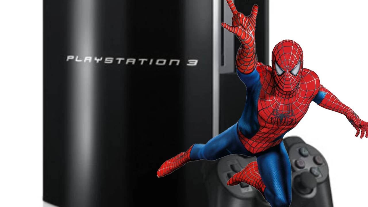
If I ask you to create the logo for PlayStation, you could probably do it even if you have no idea about marketing. After all, it is a perfectly recognizable font, the SST, which Monotype created for Sony in 2013, coinciding with the launch of PS4. In fact, Sony uses that same font for its websites, the menus of its televisions, and even the Xperia smartphone… although, in the past, other crazy ideas they had to unify the brand didn’t turn out as well. Or do we not remember the chaos of PS3?
Spidey Station
When the first PlayStation was released in 1994, everyone recognized it by its simple yet effective logo: a P over an S that simulated a three-dimensional effect, clearly indicating the console’s purpose. However, with PS2 things had changed: the logo was almost exclusively made up of straight lines, created by Teiyu Goto. Until now, each of the consoles had been notable for its own merits. And then, PS3 arrived.
Surely you remember it (at least if you’re of a certain age): PlayStation 3 set aside its iconic logos to adopt… the font from Spider-man, the Sam Raimi movie, which had come out five years earlier than its launch (in fact, it was released just in time to “celebrate” the premiere of Spider-man 3). Nobody understood anything. What was the point of using a font that was already associated with another franchise to promote the most important console in the world? Well, the story has more depth than it seems and is not exclusively summarized in “Both were properties of Sony.” Fortunately.
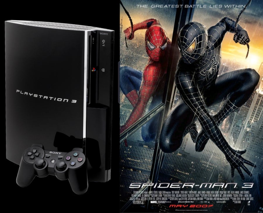
In the PlayStation 3 advertisement, which showcased its power and ability to play Blu-Rays, they did so by displaying images of Spider-man. But that wasn’t even the reason for the strange crossover: Teiyu Goto, chief designer of Sony Computer Entertainment, passionately defended that it was the right decision because it perfectly matched the curvature and appearance of the device. He was not alone, as Goto himself stated some time later.
“Instead of creating a typography with all the risks it entails, it was wiser to use the one from Spider-man, for which Sony had the rights. This is also what President Kutaragi wanted, who insisted that it be used. In fact, the logo was one of the first elements he decided on and was the motivational force behind the shape of the PS3″. So, whether you like it more or less, it was a decision that came from above. However, two years later they completely changed it and forgot about the Spider-man logo, which lasted only two years on the market.
The reason was not the memes or that people had realized the trick, but, as Kaz Hirai stated, for a practical reason: “When you spell out PlayStation 3, it took up so much space that if you wanted to put it on a billboard, it became tiny. It didn’t work because of visibility“. Thus, PS3 Slim abandoned the uppercase letters of the original logo and completely rebooted its own concept. Since then, as we live in much more boring times and less prone to craziness, Sony has unified all its fonts and concepts, and nothing will surprise us anymore. We know what the PS6 logo will be even before we see it… Unless, suddenly, they decide to use the font from Spider-man: Brand New Day. Well, so what? It would be a nice tribute.
