
After conducting several tests in July, YouTube Music has launched a redesign of artist pages in the Android and iOS apps, as reported by 9to5Google. Although the new design was scheduled to be released on September 4th, it was postponed with no official explanation, but it finally started rolling out on September 8th.

One of the most notable changes on the artist page of YouTube Music is the reorganization of the artist’s name and the number of subscribers. Previously, the name was located in the upper center, with the follower count just below. Now, the name has been moved to the left side of the screen, followed by the number of subscribers. Additionally, the new font used is much smaller and denser compared to the previous design, giving a more compact appearance.
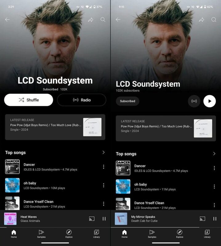
A subscription button has also been added below the number of subscribers, making it easier for users to subscribe or unsubscribe quickly. Finally, the “Radio” and “Play song” buttons are located on the right side of the screen; the button to play a song is slightly larger, with a white background, while the radio button is black.