It’s no secret that WordPress is the most commonly used content management platform in the world. Among DIY solo-preneurs, web developers and design agencies alike, it’s become the industry standard.
And for good reason:
- Incredibly easy to use and doesn’t require much technical knowledge to get started
- Open source and comes with a complete, well-documented API
- Fast, fluid, robust, and supports almost every platform and device
- Has a growing community of designers and developers who’ve contributed to its extensive library of thousands of themes and more than 55,000 plugins
But this doesn’t mean that WordPress is the right platform for your agency. This is particularly true if you’re looking to scale up on your agency’s project load, for reasons we’ll get into shortly. Additionally, with WordPress, you don’t get some of the more important business-oriented features like client management, team collaboration, and white-labeling.
In other words, even though WordPress can do a lot of things really well, it offers them at the cost of reduced efficiency.
Lack of a built-in, centralized multi-site dashboard makes project lifecycle management across domains challenging. When you have several clients with different hosting solutions, development requirements, and content systems, if it’s all on WordPress, you’ll have no choice but to manage login credentials individually. And no, WordPress Multisite doesn’t do what it sounds like it does. This isn’t a sustainable option for a growing design agency.
Duda’s design platform, on the other hand, was developed as a platform that meets the needs of agency workflows.
Duda offers tools that bring efficiency and scalability to your work environment. In this article, we’ll take a look at some of the reasons why digital agencies have started leaving WordPress for Duda and why you may consider making the switch for your team.
Easier management of client relationships
One of the standout features with Duda is that it makes it easy for design agencies to manage client relationships. Its built-in client management tools enable you to improve interactions and communication between your team and your clients. This way you can deliver better work more quickly, retain clients over time, continue acquiring new business, and drive sales growth.
Duda’s “Site Comments” feature helps you keep your customers engaged in the site design process. By allowing them to post comments directly on design projects that are in progress, you’ll be able to reduce the number of changes required afterward.
The user roles and permissions tool lets you limit client access to the more advanced features. This way you can prevent them from accidentally messing with design elements or widget scripts. On the flip side, if your clients are power users, you’ll be able to give them administrative access. With that, they can make changes and manage accounts after transferring the site over to them.
Brian Lewis, the CEO of Colorado-based design agency WebAct, says, “Duda enables us to assign highly customized roles and permissions to our clients, so we don’t have to give them blanket access to a website. Some of our customers are tech-savvy enough to make minor site changes on their own, and others would just break everything. The ability to easily turn on and off access for individual clients has saved us from hours of site maintenance work and a lot of headaches.”
Your customers will be able to access their sites and make changes through a centralized dashboard. For instance, they can easily change site themes, connect domains, or edit SEO settings.
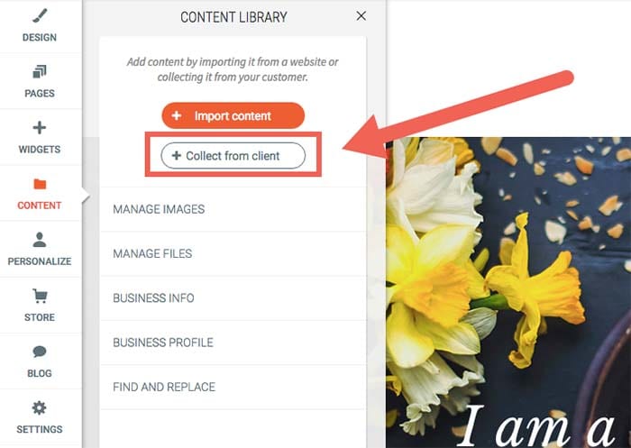
What’s more is that Duda makes it easy for design agencies to gather site content – including text and images – from clients. You can do this in one of two ways:
- Set up automated emails that’ll ask them to send you the required site assets through an easy submission form.
- Scrape content from their existing web database and insert it into your own libraries.
It also makes it easier for you to keep clients informed about site development and performance. You’ll be able to send progress tracking and regular analytics reports – personalized with your company’s logo and branding – to your clients using automated email sequences.
Allows you to offer subscription services
Duda is a complete website building platform. It offers design agencies fast and reliable hosting, e-commerce integration capabilities, a blogging platform, SSL certificates, one-click PWAs (progressive web apps), and several other useful features.
At web design agencies, customer churn is a major issue. Projects usually have finite scopes of work, and once they’re done, so is your client. Duda’s supported services make it simple to turn one-off projects into a recurring engagement.
You can even diversify the services you offer by creating subscription packages for existing clients. For example, if a client’s e-commerce store has a lot of seasonal product turnover, you can offer to maintain the product listing content. You can also keep it updated in exchange for a monthly service fee.
You might also do well to create tiered, modular monthly subscription packages for small to medium-sized businesses. Consider the following structure model as a starting point:
Subscription plan #1:
- Secure web hosting
- Round the clock security monitoring
- Weekly analytics reports
Subscription plan #2:
- Secure web hosting
- SSL certificate
- Round the clock security monitoring
- Google PageSpeed optimization and global CDN
With Duda, you also get access to several useful integrations for building your sites. These include commonly used apps and tools such as PayPal, Google Sheets, YouTube, MailChimp, and a number of social media platforms.
Built-in functionality for team collaboration
Duda enables website developers and designers to assign and perform tasks in an organized way. This helps avoid common mix-ups. For example, it avoids having multiple people on the same design team creating the same section of a customer’s site – which is more common than you think!
It also lets you easily collaborate with your team members on different tasks. In addition to this, you’ll be able to import and reuse template designs in future website projects. You can also share your agency’s libraries of themes, custom page “section” designs and custom widgets, so that your team can use them across multiple projects.
Duda’s user roles and permissions functionality can also help you manage access to site settings. When working in teams, different members are assigned different responsibilities, for instance:
- Team members #1 and #2: Designing the site’s layout for a wireframe, mockup, or prototype.
- Team member #3: Optimizing the website’s metadata for SEO.
- Team member #3, #4, and #5: Managing e-commerce and call-to-action microcopy.
By controlling access to specific sections of a site, your team will be able to focus on their designated tasks without overlap or distractions.
Nat Rosasco, Chief Creative Director and Owner of the Olive Street Design agency in Illinois, reports, “We could build a website with Duda in a third of the time it took us with WordPress, and we really liked that all of the features were geared towards a team organization. It really helped us manage our workflow much more efficiently, which meant we could scale up.”
You can also use Duda’s website comments tool to improve communication between your team members and ensure that correct and up-to-date information is conveyed to clients. Team members will be able to drop comments directly on a section of a site as it’s being built. Every individual element can be assigned a separate comment to help design teams easily convey their ideas and get responses from the same place. This way everyone involved can easily follow site development and distribute tasks when needed.
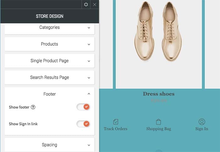
A white-label-friendly experience
Duda allows you to white-label your dashboard experience, which gives you the ability to put your company’s logo and branding on your client’s site back-end. This allows you to make the platform appear as if you own it, which reinforces the client’s trust in the experience of working with your brand.
Duda also lets you personalize pages on your back-end, including client login, dashboard, site builder, editor, and preview pages. In addition to this, your emails will carry your agency’s logo. For instance, login credentials emails, password confirmation emails, or monthly analytics reports will have your customized branding.
You’ll also be able to edit and set default branding elements like images, logos, colors, typefaces, image styles, graphic elements, background images, icons, and buttons. You can go even further and make changes to stylesheets. It also allows you to design engaging, custom-branded site previews (or functional prototypes).
Makes website personalization easy
Duda comes with some powerful site personalization tools that allow you to create and deliver different digital experiences to individual audience members.
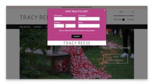
Agency designers and marketers can do this by configuring triggers and actions which generate a predetermined response based on the site visitor’s interaction. For example, if a user visits your client’s speedboat dealership website you can display a pop-up that invites them to a boat show where the client has a booth, and offer a special discount.
From a marketing perspective, this has the potential for major impact, as it maximizes the sense of belonging that the visitor feels on your client’s web pages. From an agency business perspective, the personalization engine makes for some major opportunities for providing value beyond design.
As Shane Hodge, CEO of Australian agency The Camel, puts it, “Duda provides us with the ideal set of web design tools that allows our designers to do truly excellent work. The ability to customize a site per device and add website personalization into the mix has been hands down the greatest thing that ever happened to our business…. People have been told for years they need a website, and that’s true. But for way too many businesses, these sites end up as nothing more than digital brochures.”
“A business owner would hire a developer and spend thousands on it, and in the end they wouldn’t see any tangible ROI — Duda’s website personalization tools changed that,” Hodge continues.
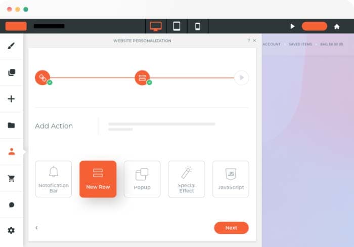
Duda has a library of triggers and actions including the end user’s device name, their geographic location, and the number of visits. Although only one type of action can be triggered on a page at any time, you can choose to create several possible actions. The action that appears higher up on the list will be triggered first.
Takes care of the technical details
With Duda, you don’t have to worry about the technical stuff like finding the right hosting solution for clients or installing SSL certificates. Its built-in features take care of these “under the hood” aspects of web design work allow you to focus on your core business activities.
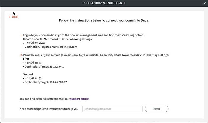
All Duda websites are hosted on Amazon Web Services (AWS), one of the most reliable cloud hosting providers out there. Duda gives agencies access to unlimited storage and bandwidth, free hosting, SSL certificates, and mobile responsiveness. As a result, you’ll be able to deliver the best website design and development services around. All you need to do is point the domain’s DNS settings to Duda’s servers, and you’re good to go.
Additionally, Duda’s platform guarantees that your websites are GDPR compliant. It gives you ready-to-use resources like privacy policy templates, cookie notifications, and user consent forms.
All websites created on Duda’s platform are optimized for Google PageSpeed. It delivers your site content (like copy, images, and videos) to visitors through a global content delivery network (CDN), minifies CSS code, and supports lazy loading of below-the-fold elements.
Conclusion
With Duda, agencies are able to deliver fully white-labellable experiences and personalizations to clients that you simply can’t get with WordPress. More specifically, you’re able to:
- Simplify client management.
- Improve internal design team collaboration.
- Look professional by delivering a fully white-labellable experience.
- Diversify your offering by offering subscription packages.
- Personalize client website using combinations of triggers and actions.
- Stop worrying about the technical side of things and, instead, focus on growing your business!
What are some of the features you look for in an agency-focused site building platform? Let us know by commenting below!