7 best Android emulators for playing mobile apps on your PC

Play your favorite Android games on PC with these great emulators.

pc game

Fans of mobile games can sometimes find it frustrating to not be able to bring their games to PC. Having a larger screen, being able to have multiple accounts on one game, and being able to do other things on your phone while you play, are just a few of the benefits to using an Android emulator on your PC. It’s definitely worth trying out if you play any mobile games right now. Here are some of the best emulators you can find.

Best Android emulators for PC

7. Genymotion

If you’re more into developing mobile apps, then this emulator can be a great addition to your work. Not only does it allow you to test out different customized applications, but it has specific designs and models for creating your own mobile games. Of course, like the rest of this list, you can use it to play other mobile games, but this emulator is one of the best for developers, or people who are interested in a game’s code.

Genymotion Free Download
7

6. MEmu App Player

One of the great things about MEmu is the ability to run multiple instances of a mobile app simultaneously. This means you can have multiple accounts on one app working together to enhance your experience within that game. You can also set them to automatically do specific functions on their own, such as running the same mission in a game over and over again. It is really good for optimizing your time spent on your mobile games.

8

5. BlueStacks

There are a few emulators that are extremely popular, and BlueStacks is one of them. Assuming your computer has the specs to back it up, BlueStacks can be one of the fastest emulators available. The speed of connectivity and framerate can be faster than actual mobile devices as well. This makes it one of the highest-end emulators there are.

BlueStacks App Player Free Download
7

4. Andy

Something really cool about Andy is that it lets you connect your phone as a controller for your mobile games. This means you can keep your number controls but play on your phone with a much bigger screen. It also lets you have the luxury of switching between different programs on your computer while you’re playing a game on your phone.

Andy OS Free Download
6

3. ARChon Runtime

A pretty customizable and easy to use emulator compared to some of the more complicated ones on the list because it works as a Chrome extension. ARChon is a great choice if you want a program that’s easy to set up, with minimal extra work involved. This program lets you jump right into gaming with surprisingly high downloads speeds. If you don’t want to worry about configuring your settings, then this emulator is your best option.

2. KoPlayer

One of the few ad-free emulators, which can be quite a refreshing take if you have tried many other types before. Like MEmu, KoPlayer also allows you to run multiple instances of the program, which means you can play on multiple accounts at the same time. Combined with the lack of ads, this creates a really nice setting for players who want to be quick about their daily gameplay.

KoPlayer Free Download
8

1. Nox Player

This is one of the most popular Android emulators, probably because of how smoothly it functions. While not all computers are able to handle the graphic intensity of some phone games, Nox is one of the easier ones to manage this on. Additionally, there are very few bugs with the Nox program, and it rarely requires reinstallation. Compared to any other emulator, this is the best-running one out there, with little-to-no problems ever arising.

Nox APP Player Free Download
7

It is important to note that you can only use these emulators to play free games and apps. Anything that is free in the Google Play store is perfectly legal to use, since Android is an open source OS. However, attempting to purchase apps with these emulators will likely not work.

Some of these emulators may require your PC to have high graphic abilities. As such, running them on a low-spec PC or laptop may cause them to run somewhat slower. Don’t let this keep you from using an Android emulator, as there are still plenty to try. While one may not work well on your computer, another may work perfectly fine. Be sure to check out our Softonic Solutions page for more Android emulators to check out.

Microsoft’s new Windows operating system will look quite different

Windows Lite to have a redesigned Start menu and no Live Tiles.

New Microsoft Operating system

It is no secret that Microsoft is working on a brand-new Windows operating system. Windows Lite will be a stripped-down version of Windows 10, designed for use on machines that aren’t as powerful as some of the more top of the line computers on the market. If you think it sounds like Windows 10 S, you wouldn’t be wrong as Microsoft is trying to move in on Google ChromeOS territory. With demand for Google machines on the rise, Microsoft wants a piece of the action.

ChromeOS started its life as a browser-like experience, but it has grown to see useful new features added that make it a competent operating system in its own right. It is, however, still a much lighter piece of software than Microsoft’s flagship operating system. If Microsoft is to strip down Windows 10 to take on ChromeOS, it stands to reason that a few features will have to go. The first news about those features is starting to come through.

Windows Lite to have a redesigned Start menu and no Live Tiles

Microsoft first introduced Live Tiles with Windows 8. The idea behind them is that rather than being static app icons the Live Tiles can also show live information from the app. The Mail Live Tile could show information from that email you’ve just received while the Photos Live Tile might flick through some of the photos you took on your last trip.

Windows 8 was Microsoft’s shambolic first move into touch control. Live Tiles were supposed to be big touch-sensitive icons that would look good on a tablet and they also made their way onto the now defunct Windows Phone OS. With Windows 10 having a tablet mode, there is an argument that including Live Tiles in Windows 10 made sense.

The reality, however, has been that not many people take advantage of a feature that turns the Windows 10 Start button into a bloated over-sized beast. According to a report by Windows Central, Microsoft has internal documentation showing that users prefer pinning stuff to the taskbar rather than opening up the Start Menu and clicking on icons.

Microsoft itself hasn’t been paying too much attention to Live Tiles either. They haven’t been updated for quite some time, despite the fact Windows 10 is constantly receiving updates that users can’t avoid.

It makes perfect sense then for Live Tiles to be the first on the chopping block, if Microsoft is looking for features to cut from Windows 10. With the software giant pinning its hopes on Windows Lite being a more agile younger brother to Windows 10, features that nobody really uses will be easy targets. The tricky part will be when they have to start cutting things that Windows users know and love.

Which Windows 10 feature would you hate to see Microsoft cut for the release of Windows Lite?

Google Hangouts is officially on the way out

The Google Hangouts shutdown will begin October 2019.

google hangouts to be shutdown

Google Hangouts is Google’s most popular messaging app. On mobile, Hangouts has seen over 1 billion downloads on Android and for desktop, it has enjoyed its privileged position as the main chat facility for Gmail’s 1.5 billion users. It has been around for over 13 years when it started its life as Google Talk. Google has now released details of how it will shut down Google Hangouts and move users to its new app: Hangouts Chat.

Hangouts Chat Download now
6

The Google Hangouts shutdown will begin October 2019

In a blog post announcing the Hangouts shutdown, Google described how it will be enterprise Gsuite customers who will be the first to see the app go. The post mentions a piece from 2017 in which Google talked about the next generation of Hangouts focusing on team communication and it seems that the new timetable shows how this move will be implemented.

According to the recent blog post from Google, these are the key dates to be aware of in the lead up to Hangouts retirement:

“…timeline of changes

  • April 16, 2019 – Several changes that may require administrator action.
  • Between April and September 2019 – Features from classic Hangouts will come to Chat.
  • October 2019 – Start retiring classic Hangouts for G Suite customers.”

G Suite users will start to lose access to Hangouts in October with regular consumers being switched off sometime in 2020.

For those who like Hangouts, the good news is that from April, Google will begin work on migrating some of the key Hangouts features to Hangouts Chat. With Hangouts being Google’s most popular messaging app ever, it would be an own goal for the search giant to not include most, if not all, of the features Hangouts users have enjoyed in this migration.

The key thing to understand here is that essentially Hangouts is now three apps, but that the two newest apps mark different key features from the original Hangouts app. Hangouts Chat is the Slack-like app that will deal with messaging, while Hangouts Meet is a video-conferencing app. To avoid confusion around this issue, Google is now calling the original Hangouts app Hangouts Classic. Google HQ is now committed to taking the best of Hangout Classic’s features and moving them across to the two newer Hangout apps before decommissioning it.

The funny thing about all this is that Google is doing it to simplify its messaging app output. Google is currently carrying out plans that will remove Hangouts and Google Allo from its roster. Once they’re gone, that’ll leave Google with five messaging apps available, which is the same number of apps it had before it introduced Hangouts Chat and Hangouts Meet.

This new direction doesn’t appear to make too much sense and hinges on the successful migration of users from Hangouts Classic to Hangouts Chat and Hangouts Meet. Maybe all will become clear further down the line, but it is clear that the next few months will be crucial for Google’s messaging strategy.

This is how to block bands and artists you don’t like on Spotify

Users have been reporting on social media that they’ve spotted a new block artist feature on their Spotify apps.

Spotify

Music is a truly polarizing force. We love some artists and we hate others. Two true emotional extremes brought on by different arrangements of rhythms and beats. When it comes to loving music, nobody helps more of us find the music we love than Spotify, which has more monthly subscribers than any other music streaming service. For hating music, however, Spotify has always taken the position that it can’t be that bad.

Spotify Download Now
8

Back in 2017, Spotify publicly stated “after serious consideration” that it wasn’t going to start allowing us to block the artists we don’t want to hear. If we’re is listening to Discover or a public playlist and a song from that artist we just can’t stand is coming up, we just have to hit skip once it comes on. Spotify decided against offering a way of automatically filtering out those artists we hate. This has now changed.

Users have been reporting on social media that they’ve spotted a new block artist feature on their Spotify apps. According to a report by Thurrott, this roll-out has only reached members of the Spotify beta program on iOS, which means the streaming giant is still testing the feature. The same report goes on to say that, although Spotify’s official position is still that you can’t block artists, it has been testing this exact feature for months with a select group of users. The reason more people are reporting the feature now is that the test has recently been extended to a larger group.

How to block artists on Spotify

To block an artist on Spotify you need to click the icon on their profile page. This will take you to the settings menu for the artist. From here you’ll see the new option Don’t play this artist. Tapping this option will stop Spotify from playing music by that artist in the future. The feature will even prevent you from manually selecting music by blocked artists.

the ... menu on spotify
Seek out the artists you don’t like and look for the three dots.

If you want to play music by an artist you’ve previously blocked, you’ll first have to unblock them. The only way you’ll be able to hear music by a blocked artist is if they feature on a track by another artist. Spotify’s new block artist feature won’t block tracks the artist has featured on if they’re not the primary artist.

This is the feature all you haters out there have been waiting for. I’ve been waiting for it, too. For me, it is inane pop music and generic EDM that’ll be going straight into my Don’t playlist. On top of the music I can’t stand I’ll also likely use the new feature to block artists like R. Kelly and Chris Brown. There is still no official word about when the feature will roll-out to all of us, but it looks like iOS users, at least, will get it soon. When the block artist feature comes to your phone, PC, or Mac who will you be blocking first?

The Microsoft Edge mobile browser will soon tell you if you are looking at fake news

How to use the new Microsoft Edge mobile fake news detector.

edge browser fake news detector

Fake news is like the bad smell that just won’t go away. It has helped subvert democracy across the western world and continues to cause terrible local problems in countries like India and Malaysia. Efforts to curb the spread of fake news have gained urgency over the last few years, but the problem is still growing and spreading. This latest announcement from Microsoft comes as welcome news.

Microsoft is pairing up with the company NewsGuard to add a new feature to Edge on mobile that automatically flags up fake and untrustworthy news sites. The feature has been available as a desktop Edge plug-in for a while now. The NewsGuard extension is now being built into the Edge mobile browser for both Android and iOS. According to Endgadget, the update will be rolling out in stages and Edge users will receive a notification about the update soon.

The way NewsGuard works is by rating news websites across various criteria. These include things like repetition of false content, misleading headlines, and transparency. These criteria are then pooled to create an overall trustworthy rating, which is displayed as a color-coded icon. A green icon indicates the news source is trustworthy, while a red icon will show if the source is unreliable. Clicking the icon will also open up what NewsGuard calls a “Nutritional Label,” which provides a more detailed credibility and transparency rating.

Microsoft first announced the partnership back in 2018 as a part of its Defending Democracy Program. Bringing NewsGuard to mobile apps is a big step for the fake news fighting democracy defenders. In the press release announcing the move to mobile, NewsGuard Co-CEO Gordon Crovitz said, “Releasing on the Microsoft Edge mobile apps is a milestone in the fight to bring consumers the information they need to counter false information, misinformation and disinformation online… We appreciate the opportunity to work with Microsoft, which is taking the lead among technology companies in providing its users with the information they need to counter unreliable news sources.”

How to use the new Microsoft Edge mobile fake news detector

Once the NewsGuard feature lands on your version of Microsoft Edge, you’ll have to open up Edge and go to the Settings menu. When you’re there, you’ll have to enable the new news rating option. Once active, this will display the rating icon for each site in the address bar. To see the more detailed version of the rating, simply click on the ratings icon. The more detailed credibility and transparency score will show information like who owns the site, who finances it, and more information about the credibility of the content.

Big big changes coming to Twitter

Twitter is getting an even darker mode and a brand-new web layout

twitter

Over the last month or so Twitter has been rolling out one of its most requested features. The chronological timeline arrived for iOS users just before Christmas and Android users have recently received the new feature, too. It looks like Twitter is pushing ahead with even more changes. Some of which are quite significant.

Twitter is getting an even darker mode and a brand-new web layout

In a recent Twitter exchange, Jack Dorsey, CEO of the micro-blogging site, recently agreed to fix Twitter’s dark mode. If you didn’t know it was broken, the pledge relates to Twitter’s dark blue background whenever dark mode is activated. Responding to an article by The Wall Street Journal calling for more apps to implement dark modes, Dorsey responded to a tweet by a Twitter user requesting a black dark mode.

Dorsey’s response of, “Will fix” has since been followed up by one of Twitter’s designers to say that Twitter’s design team is already working on the issue. To see what a big difference this will make to your phone’s battery life check out this report we wrote on dark modes and battery life back in November.

The other big news coming from Twitter HQ is the follow up to an announcement Twitter made back in September. The word then was that Twitter was testing a few mobile features for the desktop version of its site. In particular, the Explore tab and bookmarks would be coming to the desktop version of the site, via a redesign.

This redesign is now rolling out and it is bringing with it a few more features than we were promised back in September. Twitter’s traditional three-column design is being stripped down to two. When the update arrives, the Trends for you section will be combined with the Who to follow section on the right-hand column.

Other new features include a new emoji button, keyboard shortcuts to help you get around the website easier, an improved search function, and a much better trending section. All-in-all this represents quite the update to the desktop version of Twitter with the site getting a new, fresh look and some tasty new features to go with it.

For now, these new features are only available to a small number of users who have been given the opportunity to opt-in. If you haven’t been given the chance to try them out yet, don’t worry, you’ll get one soon. There is no official word about when the new redesign will be available for all users, but we can expect that we won’t have wait too long.


How games made the transition from 2D to 3D

The pivot from 2D to 3D gaming was a tricky transition for game companies. Discover how they pulled it off.

How games transitioned from 2D to 3D

By the mid-’90s, the 16-bit era was coming to an end. The advancement in technology brought us some incredible games that looked, sounded, and played better than their 8-bit counterparts. Games like Super Mario World, Super Castlevania IV, and Mega Man X showed that developers had perfected 2D gameplay and level design.

But as gaming technology was advancing, gamers were looking towards the future for the next big thing: 3D. Some 16-bit games, like Star Fox or Pilotwings, simulated 3D gameplay, while others, like Donkey Kong Country and Mortal Kombat, imitated 3D graphics.  Though these games were great, the unveiling of the Nintendo 64 and PlayStation truly gave gamers their first look at the potential of 3D video gaming.

The challenge of 3D game design

Creating 3D games brought an entirely new set of challenges for game designers. With only one plane to work with, it’s much easier to design levels and obstacles for 2D sidescrolling games. The ability to move in infinite directions in 3D makes for significantly more complex level design.

Every part of a 3D level is much more spread out than it would be in a 2D level, causing poorly designed 3D worlds to feel empty. Empty levels were hardly ever a problem in 2D games because everything was designed to be tightly packed and compact. With infinite movement, exploration becomes a key part of 3D level design. In 2D levels, everybody knows that you’re supposed to head to the right, but 3D levels, in their resemblance to the real world, naturally encourage players to head off in different directions and explore. This makes designing linear levels a challenge, which could cause some players to get lost. Some 2D games were more natural conversions to 3D than others. It’s significantly easier to imagine a nonlinear game with a top-down perspective like The Legend of Zelda playing in 3D as opposed to a sidescroller like Mario. For games that didn’t transition as easily, the challenge for game designers was to create levels that incorporated elements of 2D games enough to retain fans while taking advantage of the 3D world to keep things fresh.

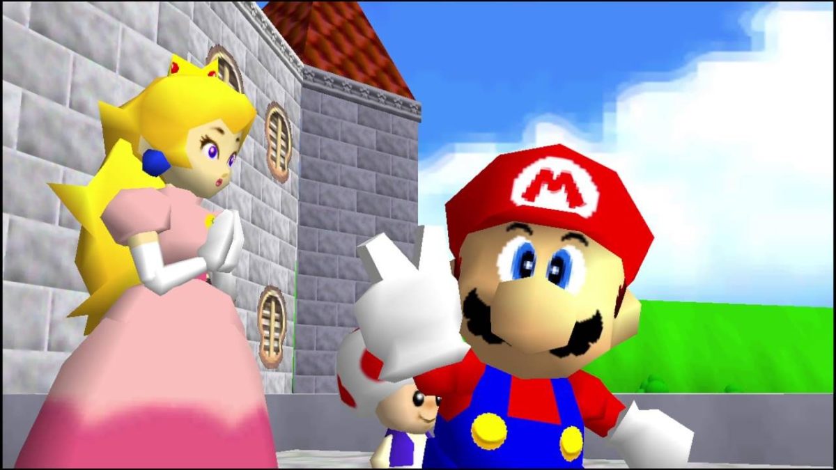
Nearly every major game franchise at least attempted to make the transition from 2D to 3D during this time. To show you how the transition was made from a game design perspective we’re going to look at two major platforming games and their first 3D entry: Super Mario 64 and Sonic Adventure.

Mario makes the jump to 3D

mario 3d

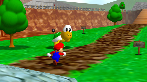
Nintendo knew right away that creating a 3D Mario game wasn’t as simple as changing the camera perspective. In the 2D Mario games, the objective was the same in every level: get to the end by running to the right. While this linear design was considered early on in Mario 64’s development, Nintendo quickly realized that moving around in 3D was fun enough on its own. 2D Mario basically had four moves: run, jump, crouch, and swim. The fun of 2D Mario games wasn’t in using those moves, but in avoiding obstacles to reach the end of the level.

In Mario 64, Mario’s moveset has been upgraded dramatically to match the more complex level design. Mario could now wall jump, triple jump, long jump, backflip, side jump, and more. This gave players significantly more options in choosing how to navigate a level, adding a high skill cap to the game without making it too complicated for more casual players. This moveset has proven so fun to use that it served as the base for every 3D Mario game since, including 2017’s Super Mario Odyssey.

The level design factored in this movement. It would be a waste to give Mario an expansive, in-depth moveset and have the goal be simply reaching the end of a level. Instead of having dozens of small levels, Mario 64 has 15 huge worlds, each with multiple objectives to complete.

There are two major reasons for this. First, 3D technology was in its early stages and development was expensive, so Nintendo saved time and money by creating 15 large varied levels as opposed to a huge number of small levels. Second, 3D level design is much more conducive to slower-paced, exploration-based worlds than tightly packed platforming challenges. Simply navigating a 3D world with Mario’s new moveset was fun enough, and having varied objectives allowed players to explore more lifelike worlds than were ever possible in 2D. The massive 3D worlds of Mario 64 blew people’s minds back in 1996, and their open-ended structure combined with Mario’s diverse moveset gave them a replay factor that was unmatched by 2D games in the series.

It’s pretty much unanimously agreed upon that Super Mario 64 is the best 2D to 3D transition in video game history. Nintendo made just the right adjustments to the popular Mario formula to help the game feel unique without overwhelming past fans. For being a first generation 3D game, Super Mario 64 holds up remarkably well today and is a shining example of Nintendo’s thoughtful game design.

Sonic speeds into the third dimension

sonic 3d

The story of Sonic Adventure is very different than that of Super Mario 64. For starters, Adventure wasn’t Sega’s first attempt at a 3D Sonic game. Sonic 3D Blast and Sonic R were both early attempts by Sega to make 3D entries in the franchise and unfortunately, both games are awful (despite their wonderful soundtracks).

The Sonic franchise mostly took a backseat during the 64-bit early 3D era as Sega studied its competitors’ attempts at 3D game design. Unlike 2D Mario games, 2D Sonic games had a momentum-based platforming design that allowed skilled players to fly through levels by chaining bounces and jumps. Early Sonic games had much more spectacle than 2D Mario games, as technically impressive segments had Sonic flying through loops and running through pipes. Though these segments took control away from the player, they were impressive enough at the time to make up for it. Because Sonic is a significantly faster-paced platformer than Mario, it was technically unfeasible for Sega to create huge cinematic levels with N64/PSX/Sega Saturn era technology. Sega’s first big attempt at creating a non-spinoff 3D Sonic game came with the Dreamcast, a console with power more comparable to a PS2 than an N64.

While Mario 64 was an attempt by Nintendo to move forward with the Mario series, Sonic Adventure was an attempt by Sega to totally reboot it for the new generation. Sega tried to create a Sonic experience that was only possible on (what were at the time) next-gen consoles, complete with fully-voiced cutscenes, revamped character designs, and a complex story.

This cinematic approach to the game influenced the level design. Sonic Adventure features multiple hub worlds that unite all of the game’s levels. These hubs are massive and filled with secrets and NPC’s, making them seem more like lived-in worlds and less like 3D obstacle courses. These worlds were big enough to actually get lost in, but a helpful hint system mostly alleviates this.

The actual levels of Sonic Adventure resemble 2D Sonic levels in design and structure, as the goal of each Sonic level is to reach the end of the stage. (Note: There are seven playable characters in the game, but for the sake of simplicity we’ll be focusing on Sonic’s gameplay and levels). While Sonic’s moveset didn’t receive the overhaul that Mario got in 64, he received a simple but crucial move: the homing attack. By pressing the jump button in midair, Sonic will home in on enemies, springs, and other interactable objects. This simple addition helped alleviate the depth perception problem that plagued many 3D platformers, though it did arguably take some control away from the player. The only other significant addition to Sonic’s moveset is the ability to spin dash while moving, allowing the player to build up an insane amount of speed.

Sonic’s levels are focused on momentum and moving fast just like the 2D games, but they have a much greater focus on spectacle this time around. Moving far beyond simple loop-de-loops, Sonic Adventure had the blue hedgehog flying through a tornado, outrunning a killer whale, snowboarding down a mountain, and speeding down skyscrapers. These segments are flashy and entertaining, but they almost completely strip control away from the player. Attempting to jump or move around during these sections often breaks their scripting, either slowing Sonic to a screeching halt or sending him flying towards his doom. While it feels great to be moving so fast in a 3D space, the lack of direct control can make the game feel too much like a movie rather than a game. Each level is carefully crafted to be beaten in a certain way, and attempting to complete levels in an unorthodox way causes the level design to break down.

While Sonic Adventure succeeds in translating Sonic’s trademark speed to 3D, its focus on tightly scripted cinematic segments, as opposed to freeform gameplay, hurts the game as its flashy sections get less impressive with age.

What early 3D games are your favorite? Do they still hold up? Let us know!

How Nintendo Switch connects to TV in 6 easy steps

Connect your Nintendo Switch to your TV in just a few minutes.

switch on TV

One of the more charming features of the Nintendo Switch is how versatile the platform is when it comes to choosing how you want to play. You can cozy up in bed and use the touchscreen, slot the two Joy-Con controllers to either side of the screen and play like a retro Gameboy, or you can stream it to a full-on TV monitor. This guide will be showing how to bring your Switch game to the big screen in 6 very simple steps.

Additionally, you’ll be happy to know that (aside from the TV itself) everything you’ll need to use comes right in the box. Let’s get right to it.

Guide to connect your Nintendo Switch to your TV

1. Open the Nintendo Switch Dock

Don't worry about the USB port; we won't need it for this.
If you open the back panel you’ll see where the AC and HDMI need to go.

If you take a look at the Dock itself you’ll find that the back panel easily unhinges as shown in the picture above. Take a peek inside and you can see three ports where cables go: AC adapter, USB, and HDMI out. The ones we’ll need are the AC and HDMI.

2. Attach the HDMI cable

Everything's packaged separately but all inclusive with the Switch purchase. You have all you need.
Attach the HDMI cable inside the Switch Dock. Next, we’ll do the same with the AC.

The Nintendo Switch comes with an HDMI cable, so you won’t need to hunt around for one or yank one off one of your other devices. Go ahead and insert the HDMI into the Dock where it reads ‘HDMI out.’

3. Attach the A/C adapter

Now do the same thing with the A/C adapter – attach it to the Nintendo Switch Dock. It should look like this:

The USB in the middle is for wireless internet connection among other things
Once both cables are in the Dock, you can close the back panel flap.

You can even snap the back panel back up to keep the inside of the Nintendo Switch Dock from getting too dusty.

4. Connect the HDMI to your TV

Now take the other end of the HDMI cable and put it into your TV. Every TV screen is built a little differently, but the HDMI port is usually in back and labeled clearly.

If it's not in the back, check the underside of the screen itself. Sometimes it's there.
Plug the other end of the HDMI cable into your TV

5. Plug in the A/C adaptor

Now to power the Nintendo Switch Dock! Plug the A/C adaptor into the nearest outlet and you’ll run power to the device.

6. Dock the Nintendo Switch

The final step is to turn on your Nintendo Switch (making sure the Joy-Con controllers are first removed) and slot it right into the Dock. When you slot it be sure the screen is facing away from the back panel, and is aligned with the side featuring the Nintendo Switch logo. If you put the Switch in backward the Dock won’t recognize it, and you might scratch the screen.

Whoever took this pic is gonna have to take those controllers out though ...
Turn on the Switch, dock it, and you’re good to go!

And there you have it! You should now be seeing the Nintendo Switch broadcasting from your TV screen.

Since the Switch itself is docked, you won’t be able to use the touchscreen while viewing the game on your TV. That leaves you to play one of two ways: You can hold one Joy-Con controller in each hand (Nintendo encourages you to tie on the wrist straps so you don’t accidentally drop one), or you can slot both into the Joy-Con Grip if you want it to feel more like an Xbox or PlayStation controller.

If you’re still having trouble getting the Switch to show on your TV, check out this video that demonstrates where to go in your Switch settings to be sure everything’s seeing each other:

We hope this guide was helpful, and that you’ll be able to enjoy your Switch games from the comfort of your favorite couch! Let us know if we were helpful in the comments below, and happy gaming!

How social media is changing the way our world looks

You may not have noticed, but the world around you is changing because of social media. Here’s how.

selfies

Flawless skin against pastel backdrops, beautiful food in abundance, and travel shots to die for. The rise of image-based social media means we’re constantly scrolling through a digital catalog of how life is supposed to look.

But, it’s worth pointing out how spending time online has changed the way things look in the offline world. Our perception of beauty is changing on the whole. Sure, trends come and go, dictated by what’s going on in the world.

But, on the broad scale, we’re looking at something new. The way we take in life’s aesthetic experiences is changing. Just the fact that we call everything from eating to looking at clothes “an experience” is a relatively new development.

From museums to filtered beauty and how we think about food—here are some ways that social media aesthetics have changed our perception of the real world.

How social media is changing the way our world looks

Social and our cultural institutions

A 2017 La Placa-Cohen report says our definition of culture is changing. We’d rather be entertained than educated, it says.

Look at the museum culture now. Hot exhibits have people standing in line to take selfies.

There’s been an influx in several social media-centric galleries, museums, and popups like the Color Factory, the Museum of Ice Cream, and the Museum of Selfies.

For traditional museums, once photo-free zones, norms are changing. Exhibits that photograph well are becoming a source of revenue for these institutions, so museums are increasingly forced to get on board with Instagram.

On the one hand, it’s cool that there’s a renewed interest in the museum. There’s also the question of how we’ll judge the real-life version of a painting. Or, whether those pieces that don’t photograph well still have merit — will they be passed over for those with the right color schemes?

Makeup industry has exploded


View this post on Instagram


Did you get your brand new #Kylighters yet? ✨ Which shades are you loving? @annybeeutee

A post shared by Kylie Cosmetics (@kyliecosmetics) on Jan 23, 2019 at 7:26am PST

Makeup is undeniably having a moment. From Glossier to Kylie Cosmetics to all things Korean beauty and face masks — it’s safe to say, social has had a major hand in our collective obsession.

The why is pretty obvious: cosmetic brands have a huge advantage on visual platforms. They can now show how products look, instead of rattling off a list of benefits. There’s also something soothing about watching people draw swatches on their arms or explain how to use a product.

Self-made makeup gurus have created a culture that thrives on the internet, offering tutorials on how to create these elaborate, full-faced looks. Or, what influencer Patrick Starr calls, the Full Beat Face. You’ve seen it, even if you don’t know the name, filled in eyebrows, contoured cheeks, elaborate eye makeup, fake lashes, the whole shebang.

This look is seen in selfies across the globe — and has perhaps contributed to a changing standard of beauty. Look at the rising demand for plastic surgery or the massive numbers of women attempting to recreate the Kardashian face.

On a more hopeful note, social media has broadened our idea of what’s beautiful — it’s a democratic platform that allows more diversity than traditional advertising.

Interestingly, this ability to share favorite looks so easily has contributed to a new, somewhat cringeworthy phenomenon, fake #sponcon. It’s a response to the fact that brand deals are a hot commodity–but it also shows how much power tops brands wield over a young audience.

Design trends are merging

Restaurants participate a ton on Instagram and Pinterest. It makes sense, you need to play the social game if you want to attract diners, critics, and food bloggers into your establishment.

Neon lights, murals, open spaces, and succulents. Restaurants decorate with social media in mind — some replace countertops with white surfaces that better highlight the food. Others add elaborate accent walls. These things come together to create an experience.

On the home decor front, there’s this fast-paced cycling of trends happening. Journalist Kyle Chayka says design trends get overexposed instantly — and they almost become meme-like as a result. It makes sense — scroll through Instagram, then consider the trendy boutiques and cafes in your neighborhood.

Chances are, you’ll see a similar blend of industrial chic, pastel-hued walls, and minimalism. Life has become a catalog that really stays on brand.

Eating has changed

And, speaking of restaurants, it’s not just the decor that social media is changing — it’s also the food itself.

You’re not even going to see certain foods anymore. Brown foods like meatloaf, hearty stews, and casseroles aren’t exactly hot these days — they look bad in photographs.

In some cases, chefs are developing dishes exclusively for the benefit of being extremely photogenic. Foods with bright colors and contrasting hues take precedence over taste in some cases — which of course, impacts what we order or consider “good.”

Final thoughts

Whether we want to admit it or not, many of our IRL decisions are influenced by influencers. Our desire to create a certain look on social media does have an impact on how we conduct ourselves in the real world—playing a role in the restaurants we select, the clothing, makeup, and decor we purchase, and the places we go.

Trends like fake branded content may be seen as uncomfortable to the outside observer, but it could also be seen as a way into the influencing game. Our museums might now be defined by the long lines of selfie-takers, but it also means more people visit these institutions.

On the whole, it is hard to say whether these changes are positive or negative.

But, it is worth questioning — what do we gain from documenting everything? And how does the “pics or it didn’t happen” mentality shape our expectations for analog experiences?

Top 5 apps to plan the perfect Valentine’s Day

Ready to impress your Valentine? These online tools will guarantee sparks on February 14.

valentine's day

February always sneaks up faster than you expect, and whether you’re in a long term relationship, a new relationship, or you just want treat yourself this year, we have compiled the top five websites and apps to use to have a warm and fuzzy Valentine’s Day.

Top 5 online tools to plan the perfect Valentine’s Day

1. Pinterest

Pinterest screenshot for Valentine's Day

You can’t have a true DIY without enlisting the help of good ol’ Pinterest. For those who aren’t familiar, Pinterest is a website (and app) where you can get ideas, look up recipes, or browse for literally anything you can think of. Save websites, images, or video links that users have made in the form of ‘pins’ and save them to boards that you can organize any way that you’d like. Install the Pinterest button on your toolbar so if you’re browsing and see a website that you like, you can make your own pin and save it to your account for others to see as well.

Pinterest Download Free ►
8

2. Epicurious

Epicurious screenshot

Whip up a perfect meal for two! Epicurious lets you search a meal by categories like a certain ingredient or special occasion and presents you with a ton of delicious options. Step-by-step recipes with some quick tips about what you should do ahead of time to make your dinner and dessert come together makes this app a must-have. Save recipes for later or add them to your shopping list if you’re about to head out the door to the grocery store.

Epicurious DOWNLOAD FREE ►
7

3. Hello Vino

Hello Vino screenshot

The drinks are just as important, if not more important than the food. Hello Vino helps you choose which wine will be best for whatever you’re having it with or for a special occasion. If you’re having sushi for dinner, a crisp white wine like a Chardonnay will complement your meal best. The app then lists a few different types of your wine of choice, describes the taste, gives you prices and where to go to pick up a bottle. Short, sweet, and to the point.

Hello Vino: Wine Assistant DOWNLOAD FREE ►
6

4. OpenTable

Open Table screenshot

If there isn’t a dish you haven’t managed to burn, OpenTable is the place to go when you want to go out. Start with booking ahead, and once you’ve selected the date and turned on your location settings, you can see which restaurants near you (or wherever you’ll be) are accepting reservations. Browse by cuisine, area, and whether you’d like fine dining or a more relaxed setting and you’re all set to let someone else do all the hard work for you.

OpenTable DOWNLOAD FREE ►
9

5. Groupon

Groupon screenshot

If Valentine’s Day was created by the candy companies and single life is where it’s at, use Groupon to take advantage of the amazing slashed prices on services like hot stone massages that are popular during this lame holiday. As the great Beyonce once said, “Me, myself, and I is all I got,” and what you’ve got is a great opportunity to stick it to the man and treat yourself at the same time.  50% off of Edible Arrangements? Don’t mind if we do.

8

There are a ton of things to do no matter if you’re with that special someone or if that special someone is you, so get out there and have a great time this Valentine’s Day. You deserve it.